What is Mobile First Indexing
In 2018, Google announced that it would begin analysing mobile versions of websites to make search engine indexing and ranking decisions. Through this analysis, Google refined its smartphone crawler, Googlebot and created two different bot types; one for smartphones, which is the primary crawler for indexing, and another dedicated to desktop.
Mobile first indexing was not entirely new, with Google already experimenting and tweaking back in late 2016, albeit on a much smaller scale.
The Importance of Mobile SEO in 2025
While mobile searches surpassed desktop back in 2017, the gap between the two is still growing rapidly, with Ahrefs reporting 59% of website traffic worldwide being from mobile phones, and 57% of local search queries coming from mobile devices or tablets. Optimising your website for mobile devices is crucial to capture this expanding audience and improve user experience, as users expect fast, seamless access to information on their devices.
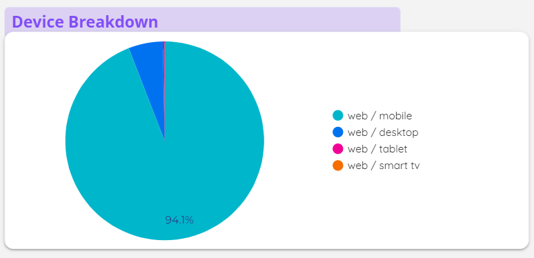
It’s even something that we see in our monthly reports here at Gordon Digital. An example being an ecommerce website we manage with a staggering 94% of their users coming from mobile.

It’s clear that you should still be prioritising your mobile experience for SEO in 2025. Incorporating the elements below will not only improve mobile usability but support and future
proof your SEO goals.
- Responsive Design: Easily the most important aspect of your website’s experience on mobile comes down to responsive design. Responsiveness simply means that whatever device a user is accessing your website on, whether it is desktop, mobile, tablet, or even a smart TV, your website adapts to the parameters of the device accordingly.
- Mobile Friendly Content: Mobile friendly content is about creating content that is easy for users and search engines to read and scan. This generally entails creating short, natural sounding paragraphs with descriptive headings and subheadings.
- Local SEO: When people are on the go, they typically use their mobile devices to search for services nearby. Google frequently crawls location pages for cities and suburbs for organic search, as well as Google Business Profiles, to show relevant local business profiles in search results, often as part of the Local Pack.
- Voice Search SEO: According to a study by Backlinko, 40.7% of all answers from voice search are from a Featured Snippet. Optimise your content so it is concise, simple, and easy to read.
The Key Differences Between Mobile and Desktop SEO
Whilst optimising your website should focus on responsiveness first, there can be some key differences between SEO for mobile and desktop.
- Screen Size and Dimensions: There should be consideration of how your page layout will display, especially when displaying elements and website assets on desktop. Mobile users favour a simpler approach, as opposed to extensive widgets.
- User Intent: A mobile user will typically be on site for a shorter time, as they are often looking for quick answers. Those on a desktop are typically conducting more in-depth research or completing a complex task (i.e on a work computer).
- Website Navigation: Bigger sites often struggle with user navigation on mobile devices, due to the number and level of pages. Condensing your pages in a hamburger menu and properly labelling key pages will help. Including a search bar is also beneficial in assisting users in locating information they can’t find in the menu. For desktop users, mega menus and mega footers can be great for proper navigation and website architecture.

- SERP Results: As of 2021, Google implemented continuous scrolling on mobile SERPs. However this means that SERP features, such as Knowledge Panels and Map Packs often appear on mobile, and are designed to capture a mobile user’s intent. As for keyword rankings, this makes true organic positions appear even lower in the SERPs, even for position 1, as other features will appear more prominently. Finally, there are differences in truncation of metadata based on pixel width on mobile and desktop.
| Title Tags | Character Limit | Pixel Width |
| Desktop | 50-60 characters | Approximately 600 pixels |
| Mobile | Mobile devices can sometimes show titles that are beyond two lines | Mobile devices can sometimes show titles that are beyond two lines |
| Meta Descriptions | Character Limit | Pixel Width |
| Desktop | 140-160 characters | Approximately 920 pixels |
| Mobile | Approximately 120 characters | Approximately 680 pixels |
Technical Aspects of Mobile SEO
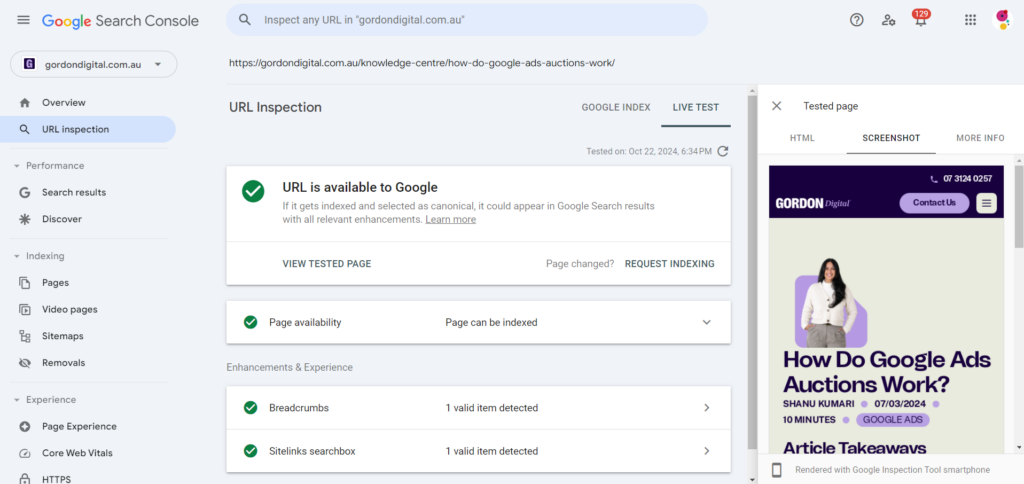
In keeping in line with responsiveness, and mobile first indexing, maintaining your technical SEO is imperative when considering mobile SEO. Firstly, use viewport meta tags to control layout on mobile devices and ensure there’s proper scaling of media. You can test this using the URL Inspection tool on Google Search Console, which will show you a rendered HTML view of the page.

Before optimising your website, ensure your website on mobile can be rendered and crawled first.
Technical SEO Checklist for Mobile
- robots.txt files don’t block mobile crawlers
- Use the same URLs for mobile and desktop versions (avoid mobile URLs)
- JavaScript, CSS, and images are not blocked for mobile crawlers
- Avoid redirect chains that can slow down mobile page loading
- Dynamic content (e.g. continuous scroll, lazy loading) is crawlable on mobile devices
- Or provide static fallbacks or “Load More” buttons for search engines
- Use rel=”next” and rel=”prev” for paginated content on mobile
- Ensure all important pages are accessible through mobile friendly navigation
- Use a flat site architecture to reduce the number of clicks to access important pages
Page Speed & Core Web Vitals
Page speed for mobile is essential for a great user experience. We’ve previously touched on the importance of page speed for SEO, but for mobile it’s especially important. Initially Google applied the ranking signal for Core Web Vitals for mobile search results only. This was later changed in 2022 to include desktop results. Based on Core Web Vitals, there are much stricter thresholds for what constitutes good performance.
| Metric | Mobile | Desktop | Description |
| Page Load Time | Under 3 secs | Under 2 secs | Time for the page to fully load and become interactive. |
| First Contentful Paint (FCP) | Under 1.8 secs | Under 1.2 secs | Time before the first content element is rendered on screen. |
| Speed Index | Under 3.4 secs | Under 1.3 secs | Measures how quickly content is visually displayed during page load. |
| Total Blocking Time (TBT) | Under 200 ms | Under 150 ms | Total time between FCP and Time to Interactive where main thread was blocked. |
| Fully Loaded Time | Under 5 secs | Under 3 secs | Time it takes for a page to reach a state where all resources are loaded. |
Accelerated Mobile Pages (AMP)
Accelerated Mobile Pages (AMP) is an open-source framework developed by Google in 2015 to create faster pages for mobile devices. AMP uses a stripped down version of HTML, CSS, and JavaScript resulting in rapid loading times.
However, AMP has fallen out of favour in recent years due to improvements in mobile technologies and responsive design. Even for news publishers who commonly adopted AMP when it was announced, the AMP requirement for appearing in the Top Stories carousel was removed, further reducing the incentive to use it.
Mobile Friendly Factors for SEO
Touch Friendly Design Elements
With a smaller screen size, especially width – mobile websites should be adaptable, ensuring any design elements are optimised for touch and taps.
Elements such as buttons and search bars are a necessity for mobile websites. However, proper spacing and sizing should be prioritised to avoid overlapping interactions between elements and potential missed taps. Form fields should also be properly sized for input and for dropdown menus.
Have important navigation elements such as hamburger menus, breadcrumbs, and scroll to top, always within thumb reach.
Reducing Pop-ups and Interstitials
Pop-ups are still a good way of generating leads in 2025. However, they can be obtrusive and a contributing factor to below par Core Web Vitals assessments. By following these steps, you can still display non-intrusive pop-ups that convert.
- Only use pop-ups when absolutely necessary.
- Delay pop-ups until a user engages or performs a valuable action. Preferably opt for user triggered pop-ups over automatic ones.
- Ensure pop-ups are easy to close on mobile devices, such as using larger, contrasting X buttons with ample tap input to avoid missed taps.
- Use inline promotions or banners as an alternative to pop-ups.
- Pop-ups should provide genuinely useful information, relevant to the page or site. Value user experience before conversion goals.
Optimising Multimedia for Mobile SEO
Displaying imagery and other visual assets on your website can drastically improve user experience, especially on mobile. Not all content has to be text-based or a blog. Content can also include infographics, diagrams, illustrations, or photos of products or team members.
Images
Unfortunately, compared to text-based content, use of media can weigh down your site, potentially causing slower speed and loading issues.
Using image compression or next gen file formats such as .avif and .webp can drastically decrease image load time. Setting the srcset attribute for images can provide a responsive approach based on size dimensions and scaling. Also implement lazy loading for your images below the fold to avoid unnecessary bandwidth usage and improve initial page load times.
Lastly, optimise file names and add alt text to images to improve accessibility and to provide context to search engines. Remember to be descriptive first and focus on keywords second.
Videos
Videos in both short and long form, depending on supporting content or relevance of the page, are great for improving time on site and providing further information without the hefty word count. If you want to showcase some testimonials or UGC, embedding videos over a direct video player will mean less weight on your site.
For accessibility, transcripts and captions are ideal ways to improve user experience and elements such as YouTube SEO. Avoid auto-playing your videos to prevent data usage issues and pick a thumbnail that’s appealing to encourage more video views.
Schema Markup for Media
For users, an image or video is a great way to break up and support existing content. Search engines will have some idea of the type of media being used based on the HTML and semantic HTML, but generally not enough context is provided. This is where schema markup comes in.
Also known as structured data, schema markup assists search engines in understanding the context of the media. Examples are:
- ImageObject: Used for individual images on a page
- VideoObject: Used for individual videos on a page
- AudioObject: Marking up audio content such as podcasts or music tracks
- MediaGallery: Detailed, structured information about a collection of media
These markups help search engines better understand and categorise certain media whilst also potentially improving visibility and presentation in the SERPs.
A Final Note on Mobile and Website Accessibility
The majority of the above, including the vital point regarding responsiveness, is in part created by the need to ensure accessibility for all users. Visually and physically impaired users, and those unfamiliar or inexperienced in using a mobile device form part of the users that regularly access your website.
Web accessibility standards are a legal requirement in Australia, and an internationally recognised standard under the Web Content Accessibility Guidelines (WCAG).
mouth by engaging in community events and local partnerships, such as sponsorship of sporting, charity, and other events. This type of local traditional marketing is still active and highly valuable even as we head into 2025.
Conclusion
As mobile usage continues to increase, optimising for mobile devices remains a must for SEO success in 2025 and the future.
From a responsive design to mobile friendly content, a holistic approach to mobile SEO is key. By prioritising user experience, speed, and technical best practices for mobile, your website can gain a significant edge.
Contact us to book a strategy session and see how our SEO Brisbane agency can unlock a mobile-first approach that positions your website for future success!
